
Lamb Weston
Updating a long-standing food brand's digital presence and B2B ordering experience.
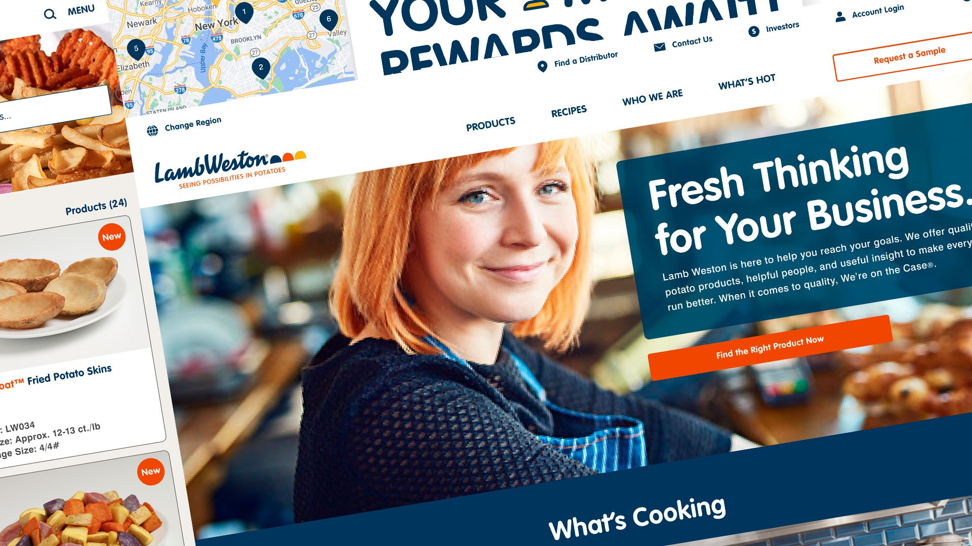
Lamb Weston is one of the world's largest providers of potato products, served at some of the best-known restaurants and chains. The company has a deep product line backed by a dedicated online sales team and extensive customer research.
The relaunch was part of a larger plan to engage operators directly. The client had already built detailed personas from prior research, so we worked with analytics specialists, researchers, and content strategists to update a long-standing brand rather than rebuild it.
Role & timeline
- Role
- Experience and design lead
- Timeline
- Multi-phase engagement
- Responsibilities
- Empathy mapping, user flows, wireframes, template system, visual design, UX/UI, prototypes, developer specs
- Key skills
- B2B ecommerce UX, search and filtering, localization, accessibility, design systems
Problem
Analytics showed customers dropping off as soon as they reached product search, the exact moment the business needed them to keep going.
Goal
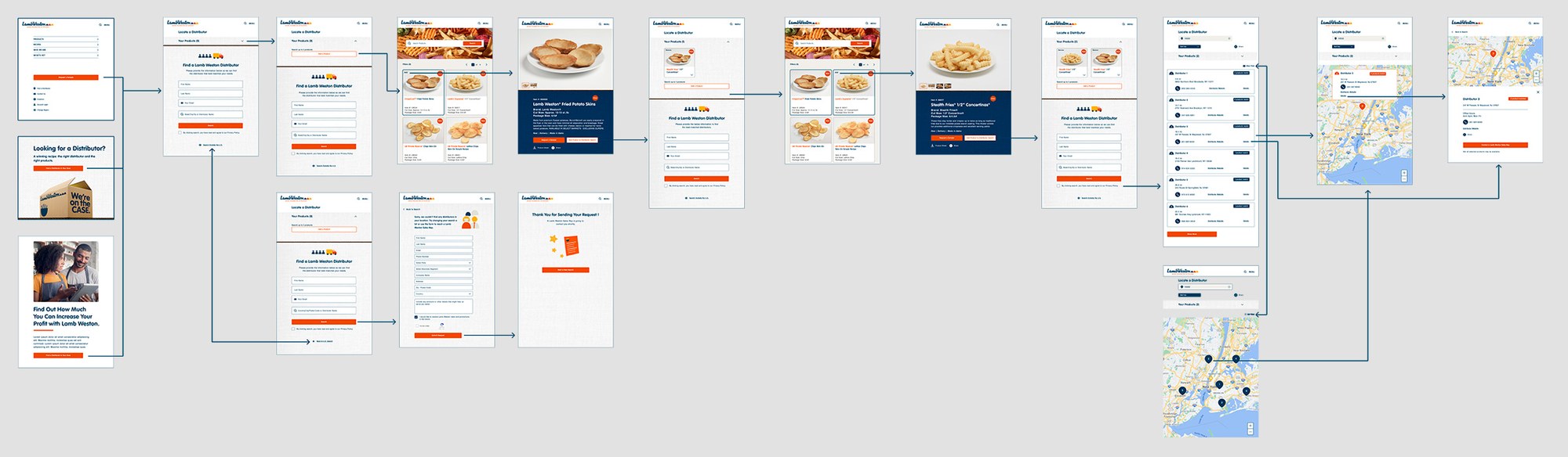
Reimagine the website and app to directly engage restaurant and hospitality operators, and get them from search to a distributor who has the product.
01
Research
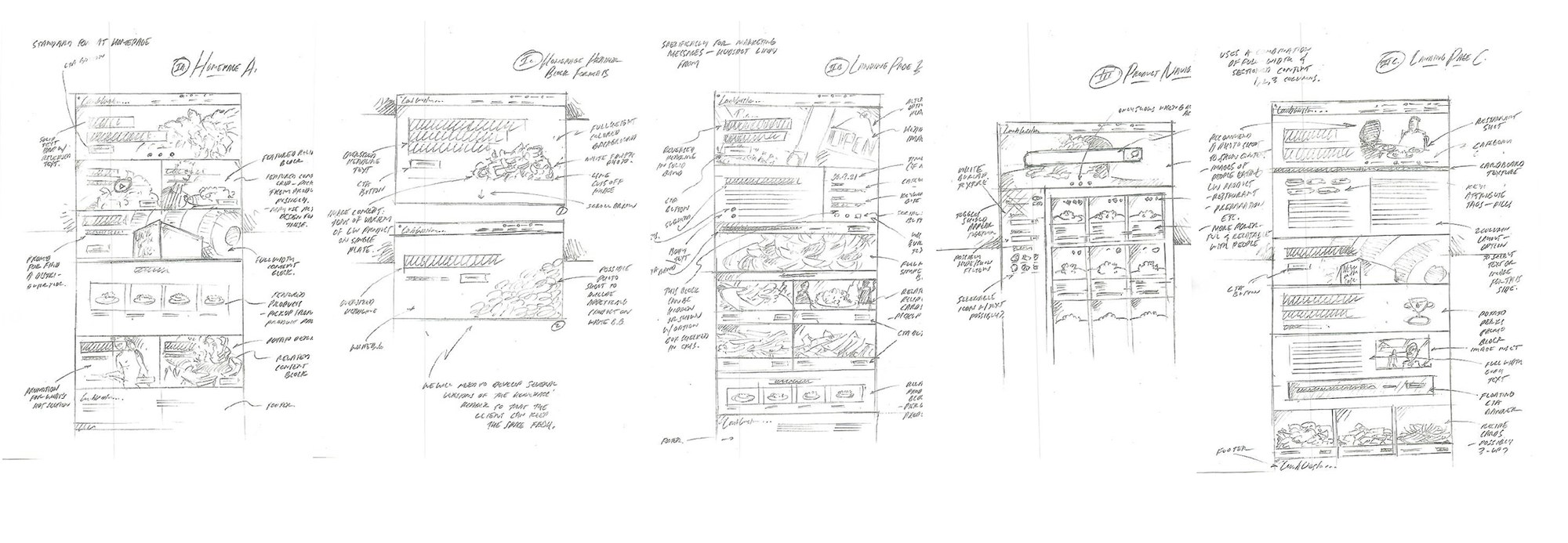
Building empathy maps and user flows on top of the existing personas let us find exactly which parts of the experience needed work. Website analytics pointed to one main problem: customers were dropping off after they reached product search, which made redesigning the filters a priority rather than a detail.
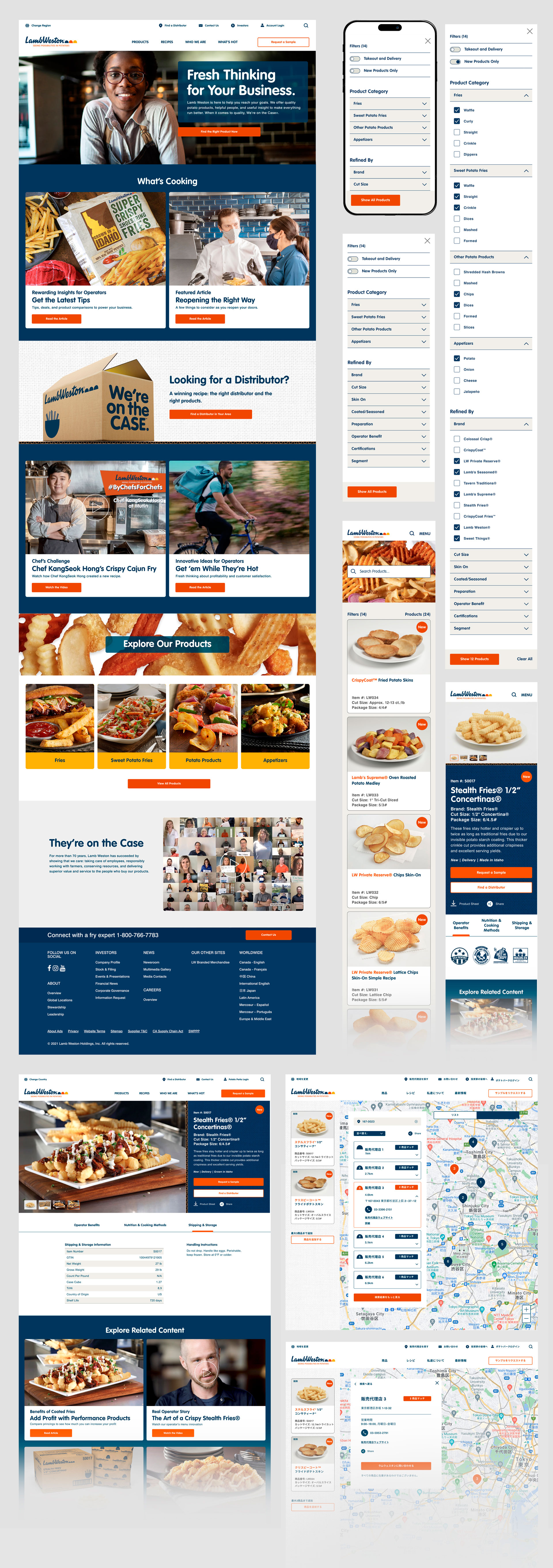
We also planned a custom distributor search tool that would show product-specific partner availability regardless of market. Telling a customer which distributor has the product in stock is the end goal of the search, and it was missing.
02
Design
All customer tools and static pages had to work in multiple languages, which shaped the content model and the component set from the start. Lamb Weston's visual branding, fonts, colors, mid-century illustrations, was dated. The brand equity was real, but the execution no longer matched what customers expected.
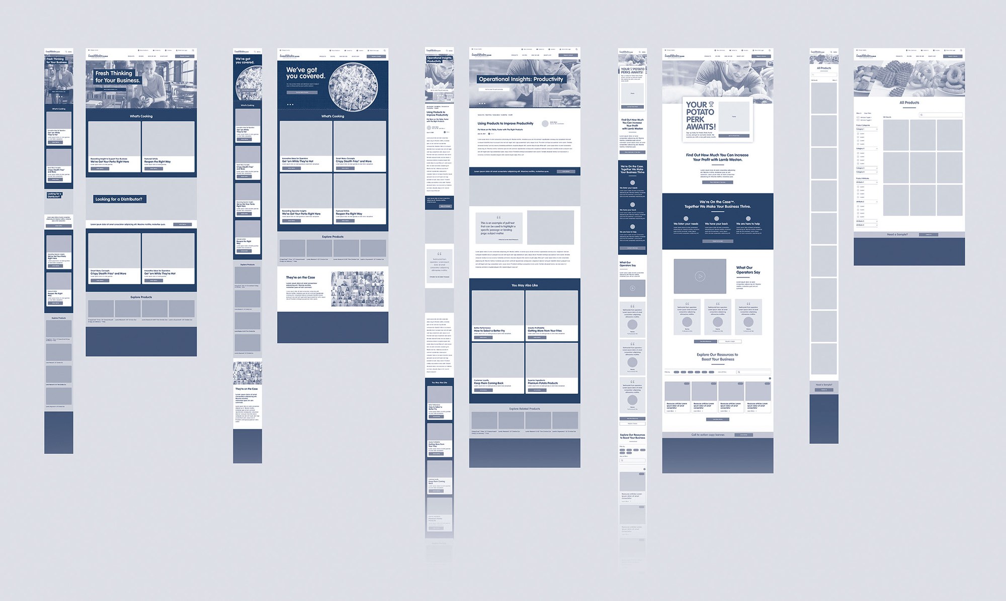
After flows and wireframing, our team built a full template system on modern standards. Visual design, UX, and UI work was done with accessibility in mind, and the brand identity was updated carefully so customers would still recognize it. Final deliverables covered handset, tablet, and desktop layouts plus working prototypes.
03
Modular landing pages
Modular landing pages were the hardest part, because the content strategy wasn't finished when design started. We solved this by building modules based on common use cases that could be assembled in any order to form a page or screen, so the content team had room to work later and design didn't have to guess.
I provided specs and worked closely with the development team to make sure the design held up in every experience.
04
Impact
During testing, the new designs clearly outperformed the old versions. After launch, completed product searches rose almost 140%, and conversion rates grew along with them.
- Increase in completed product searches
- ~140%
- Language support across tools and pages
- Multi
- Breakpoints designed end to end
- 3
Increase in completed product searches
Language support across tools and pages
Breakpoints designed end to end