
CommonSpirit Health
Find-a-doctor and scheduling for one of the largest nonprofit health systems in the US.
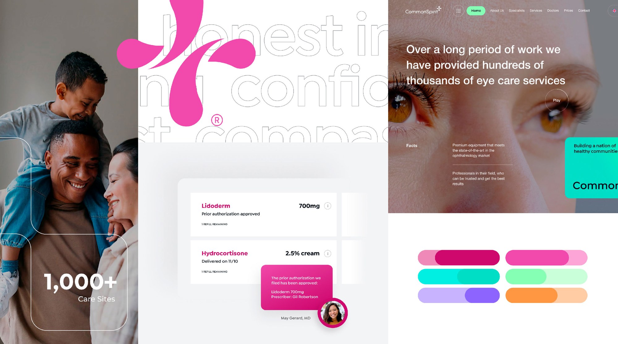
As part of a consulting engagement with CommonSpirit Health, one of the largest U.S. health systems with over 2,200 care sites across 24 states, I led design and UX for a major website relaunch focused on physician and location search.
Search is the main bridge between patients and the care they need, but the existing tools underperformed because of fragmented patterns and inconsistent flows. Earlier attempts had stalled on the sheer number of variables the system had to handle.
Role & timeline
- Role
- Experience and Design Lead
- Timeline
- Jan 2024 – Jan 2025
- Responsibilities
- UX team leadership, journey mapping, design, prototyping, user testing, and visual design
- Key skills
- Experience strategy, UX, test design, visual design, client management
Problem
Help patients connect with the right caregivers, and stop losing them to search results that missed the mark.
Goal
Deliver an online experience that reflects how patient-focused CommonSpirit is, with tools people can actually use.
01
Observed six-month outcomes
- Total patients
- 20M
- Increase in traffic
- 6.3%
- Higher search completion
- 9.2%
- Estimated business value
- $15.9M
Total patients
Increase in traffic
Higher search completion
Estimated business value
02
Overview
We designed search tools that worked together and stayed consistent across the site, with an eye toward scaling and keeping the patterns useful over time.
We started by identifying the most common user journeys, most notably patients who start with a specific provider in mind. That insight shaped a search experience flexible enough to handle everything from finding a doctor to locating a nearby facility.
Opportunities
- Make finding a medical specialist easier
- Build a friendly, efficient location search
- Improve satisfaction of patients and prospects
- Improve on-site media and content search
- Reinforce the new CommonSpirit brand identity
Metrics we worked from
- Adobe Analytics
- Google Analytics
- CRM conversion points
- EHR trends summarized by volume
- Website and competitive audits
03
Research
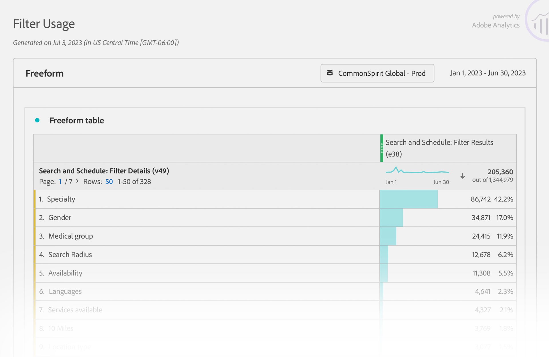
- Total visitors
- 2.9M
- On-page click rate
- 5.3%
- Blog search engagement
- 9.6%
- Homepage bounce rate
- 79%
Total visitors
On-page click rate
Blog search engagement
Homepage bounce rate
Stakeholder interviews surfaced the legacy pain points, and behavioral data confirmed them. A competitive audit showed where other health systems outperformed the legacy model, and overlaying that with decision points and component requirements gave us a roadmap everyone could work from. We wrote scenarios and edge cases to test whether future work would hold up in the real world.
Analytics also pointed to appointment setting as the next step in the journey, and where most users dropped out of the funnel.
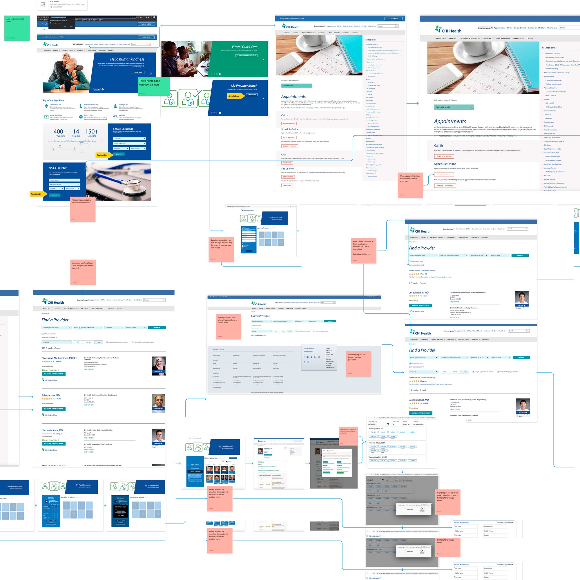
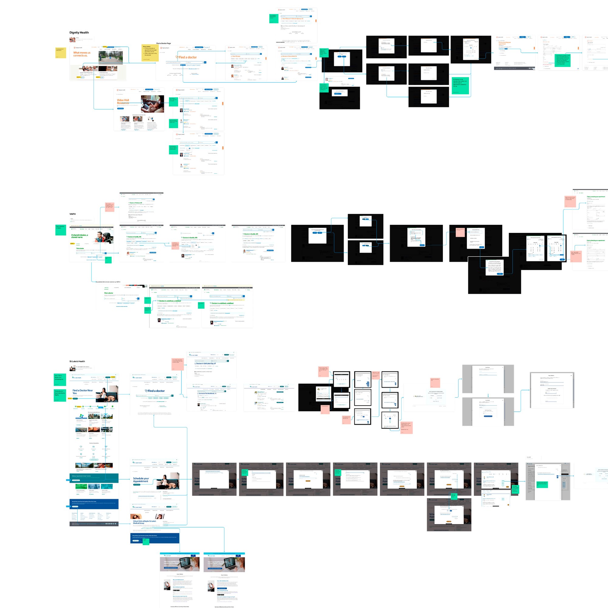
What we learned became a roadmap for all future CSH digital properties: user, business, and technical requirements synthesized into a single visual form, ending in a generalized journey for any search aimed at finding a caregiver.
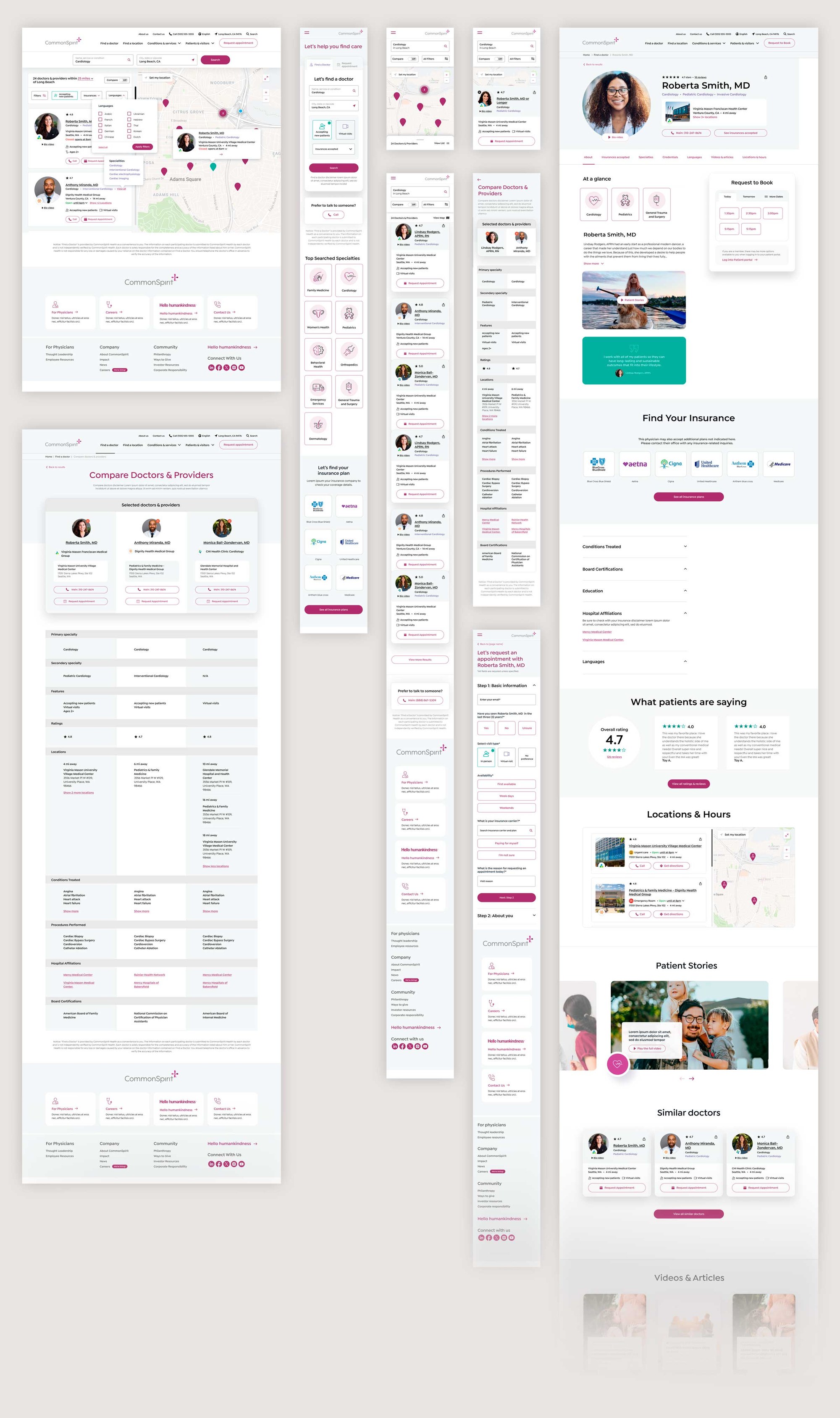
Result cards were one of the most critical pieces. They needed to show only what mattered, so a search stayed fast and matched what the user had asked for.
04
Brand & design system
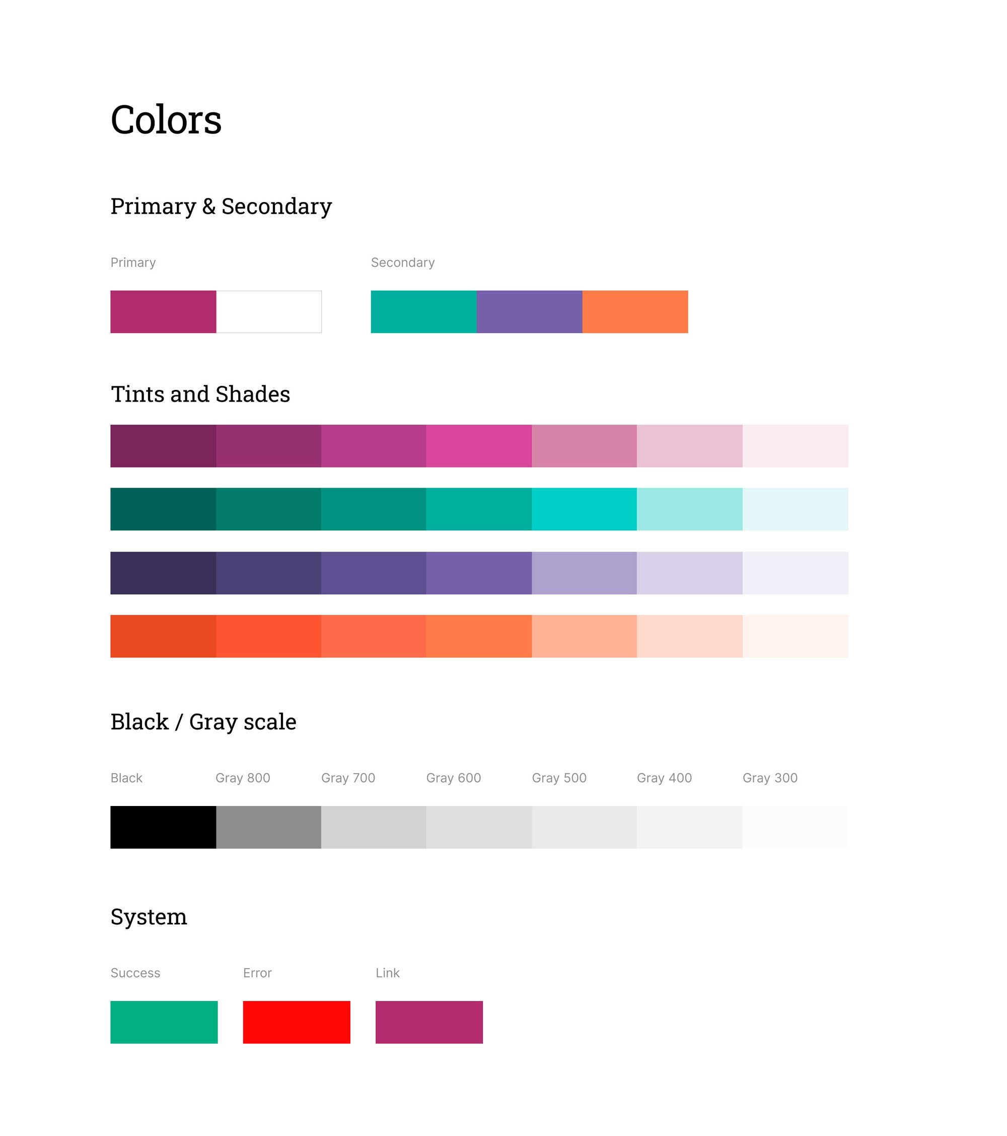
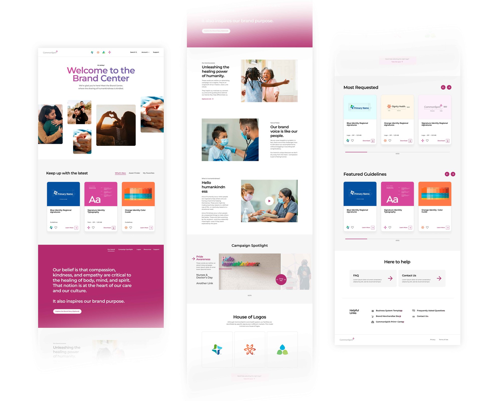
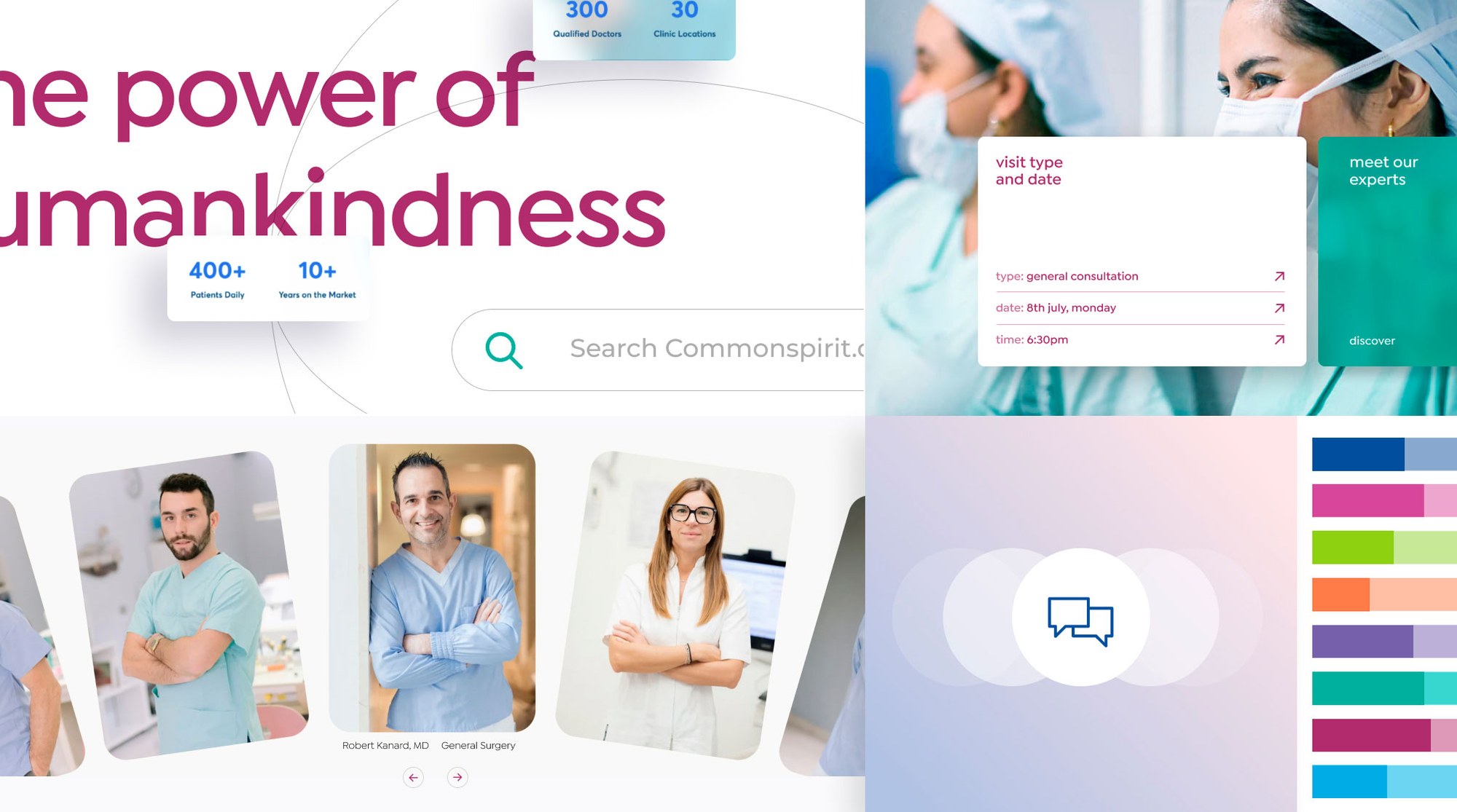
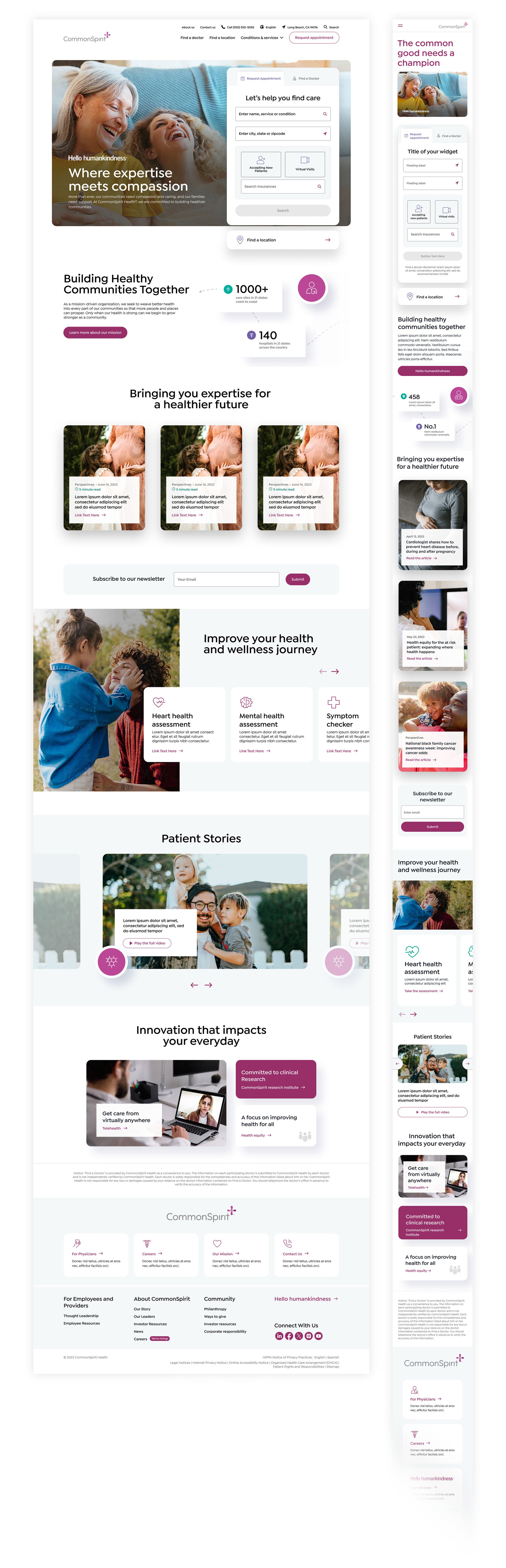
CommonSpirit was midstream on a new brand voice and visual identity, and that anchored our work. The client needed a shared place for new brand elements as they were created, so we built the smaller Brand Center site, a first step toward a style shared across all their properties.
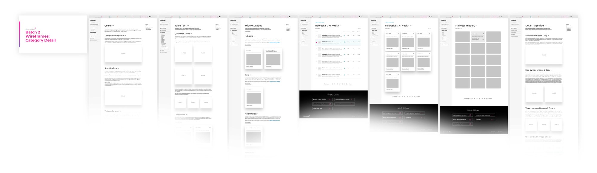
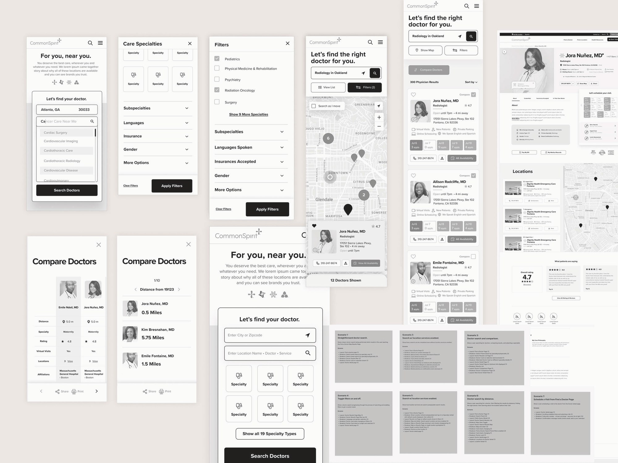
Brand Center also gave us the beginnings of the CommonSpirit design system. We worked from mood boards to wireframes with reuse on the flagship site in mind, and mapped where the existing component set fell short of the competitive experiences from our research.
05
Testing
Care usually starts with a search, and for a lot of users that search ended in confusion or abandonment. Given the range of users and motivations, personas were too narrow and made-up to be useful. We used focused research instead, tied to specific real-world interactions.
Those interactions became 12 user archetypes to test against, reflecting key parts of the user base and validating the scenarios from our roadmap.
Rather than static wireframes, we built interactive prototypes that mimicked searching, filtering, and comparing results. Automated testing flagged friction at scale, while moderated sessions let us watch users in context, sharpening features like comparing multiple caregivers before deciding.
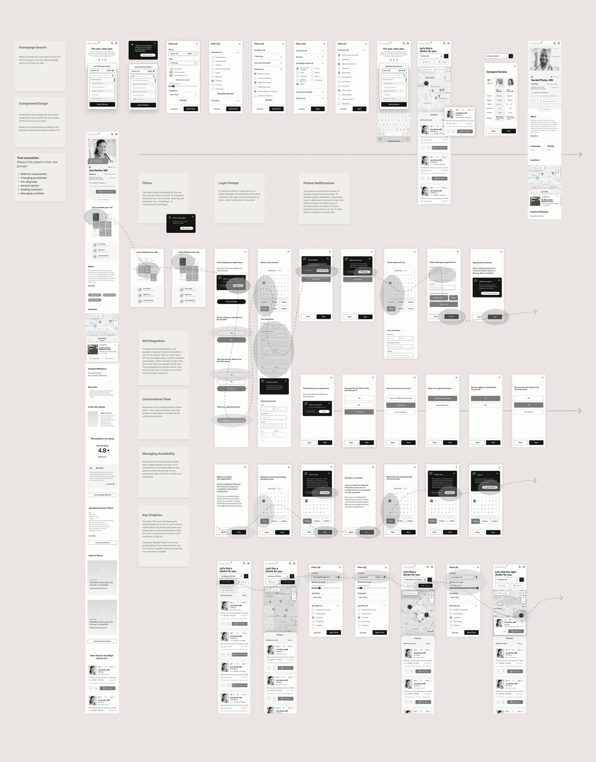
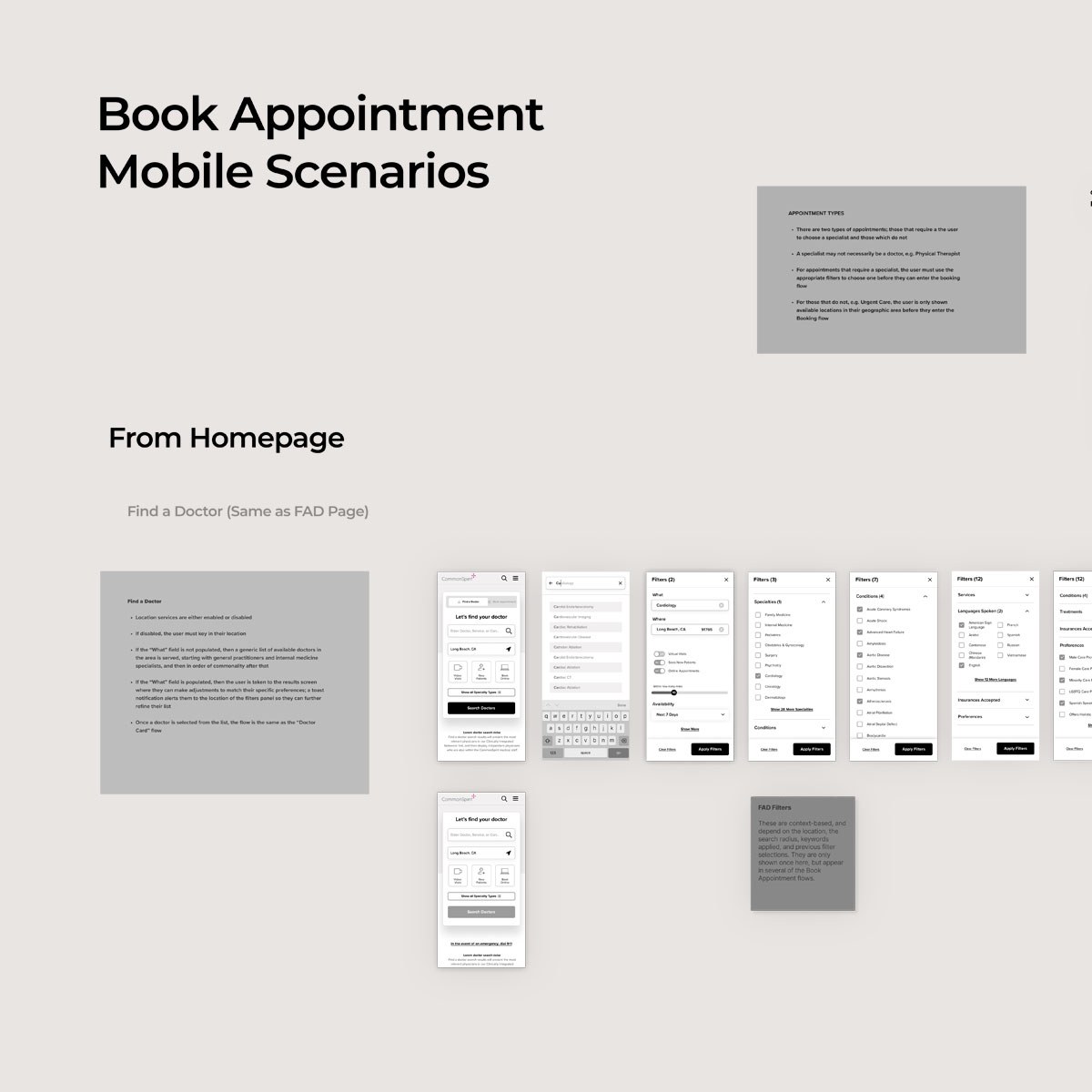
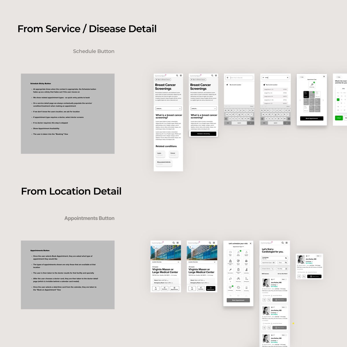
The question was never whether users could find care. It was how many gave up before they did.
06
What we found
Most interactions still centered on finding a physician or facility, usually starting from the caregiver. When users didn't enable geolocation, the platform returned no results with no fallback or prompt, which is a bad place to lose someone.
Appointment setting was inconsistent: slots shown as available were sometimes revoked after selection, which hurt trust in the system.
Facets were the third challenge. Too many options overwhelmed users, too few left them unable to narrow results. Users across age groups welcomed AI-driven scheduling as long as it was fast and forgiving of mistakes.
Findings
- Users kept browsing after getting results
- Stickier content can drive higher search rates
- Too few or too many results caused bounces
- Mobile search was often driven by place and time
- Ratings were seen as critical to care selection
- Better visibility into patient intake drove success
07
Design
Details like whether a provider spoke a given language mattered just as much. We designed overlapping filters that shifted based on the path a user was on: if a doctor wasn't taking new patients, we surfaced others at the same facility, and nearby practices that met the same criteria.
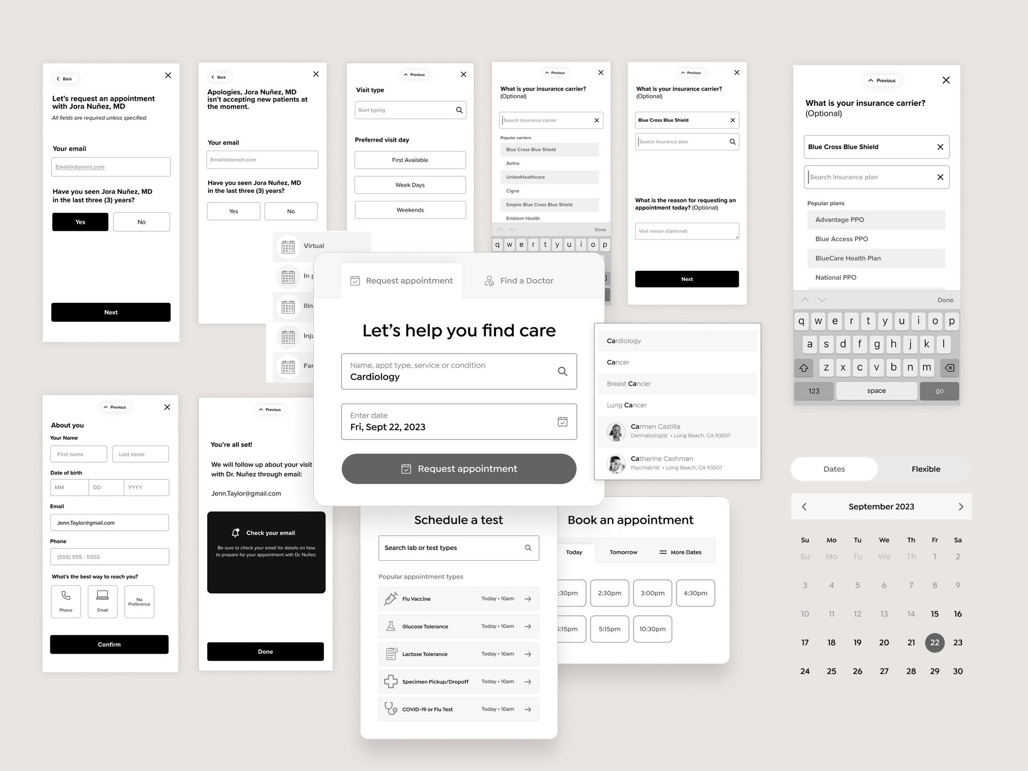
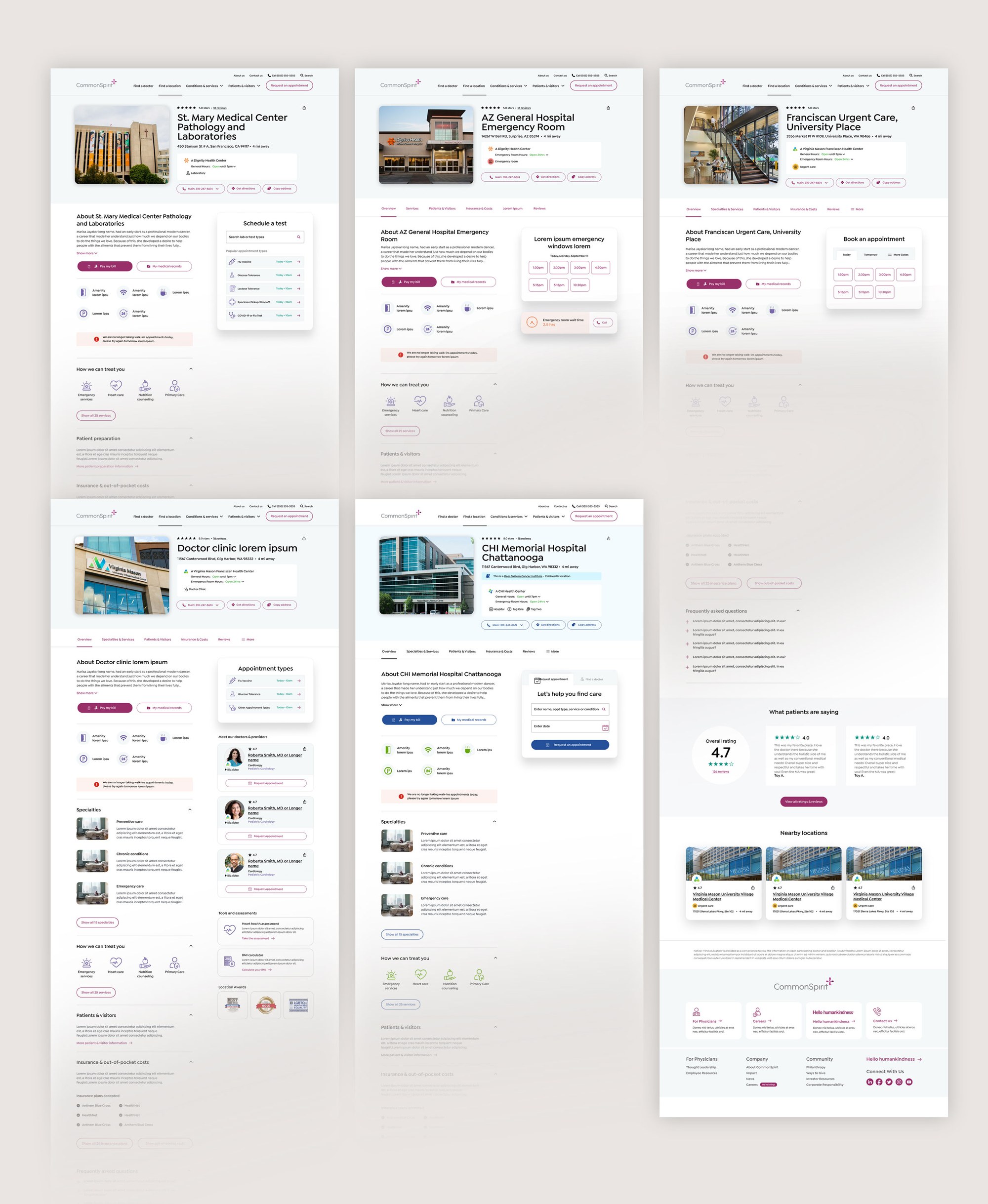
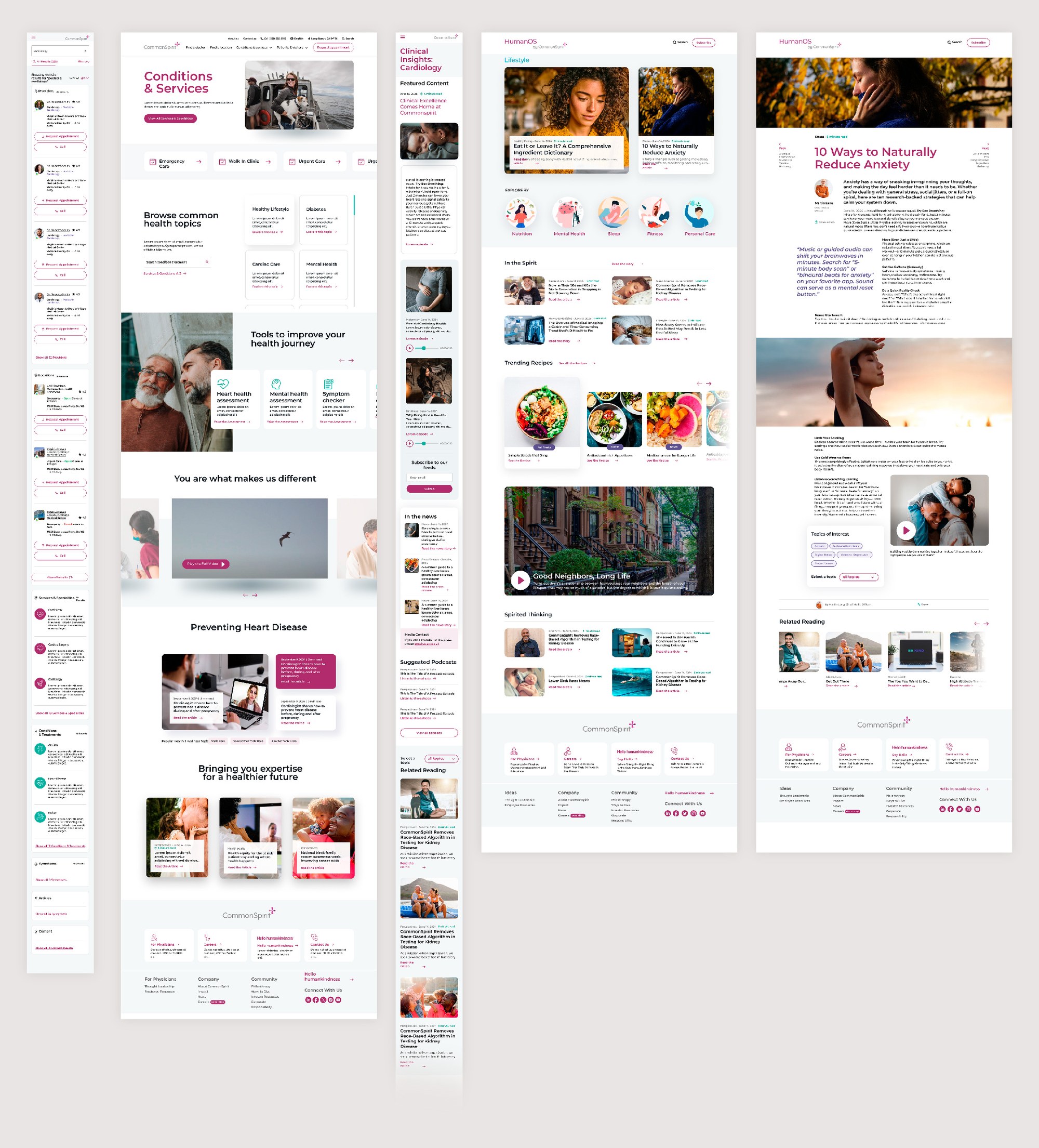
After several rounds of research and optimization, we moved on to the rest of the site: the diseases and conditions library, the blog, and utility pages, linking anchor content to user intent through a taxonomy built from the roadmap, and working with development on iterative visual testing.
08
Impact
The relaunch was a clear success, with metrics and feedback backing up the creative decisions. Low expectations for onsite healthcare search came from a lack of detail, which was our opportunity to add value with a more complete resource.
Six months in, the site was drawing positive feedback and generating additional revenue on a higher conversion rate, and the new component set gave the designs room to grow.
Successes
- Improved completion rate for physician search
- Improved completion rate for location search
- Improved overall website traffic
- Increased net revenue for the health system
- Improved interface and tightened funnel gaps
- Developed algorithms for ranking care by specialty
- Created a backlog for continuous improvement
Usability gains
- Reduction in dropped searches
- More appointments booked using the new system
- Less user frustration related to search
- Results better matched user need and intent
- More engagement throughout the entire site
- Fewer phone calls and in-person inquiries
09
What’s next
Backlog
- More compelling micro-animations at key moments
- More accurate data provided by physicians
- Doctor and location detail pages often had blank sections
- Implementation of a third-party API for ratings
- Expand support for meaningful use of EHR data
- More featured testimonials and patient input
- Increase depth of treatments and conditions content
Physician and location templates will keep improving based on analytics data. More work is planned for the post archives, with unique templates for specific types of time-stamped content. There's also a plan to bring in third-party reviews on the physician templates, replacing the site-specific rating system that exists now.