
Ellucian
Rebuilding a large higher-ed SaaS presence around buyer intent and a clearer product architecture.
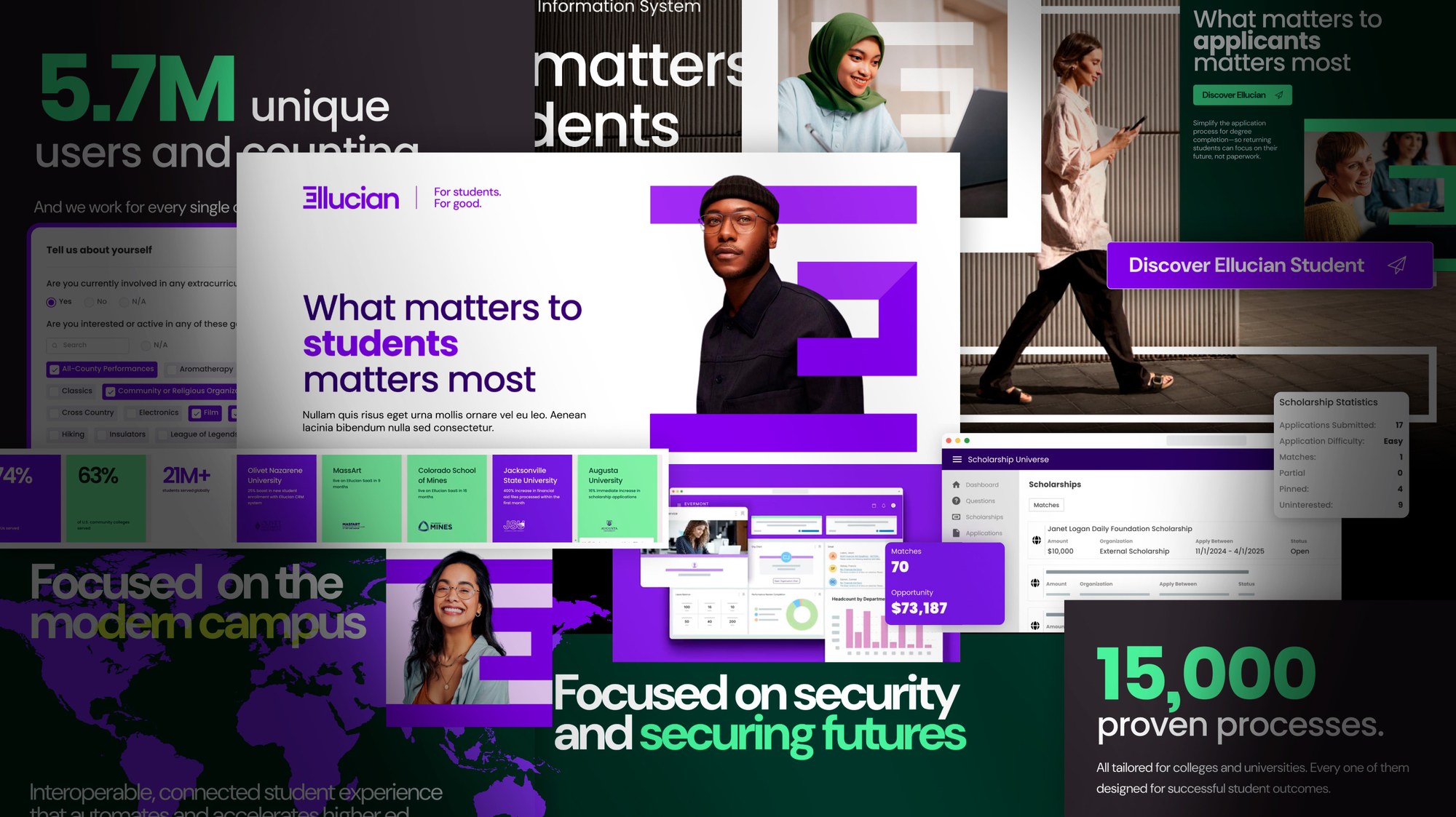
Ellucian had scale, trust, customers, and product depth, plus a real role in how higher education runs. The problem was the site: it made people work too hard.
Higher-ed buyers don't casually shop for student information systems, finance platforms, or CRM products. They compare, validate, forward links, and build internal consensus before anyone signs anything.
Role & timeline
- Role
- UX strategy lead
- Timeline
- Jun 2024 – Oct 2024
- Responsibilities
- UX strategy, research synthesis, IA, taxonomy, wireframes, prototype testing, product storytelling, conversion planning
- Key skills
- Higher-ed SaaS, SIS/ERP/CRM, enterprise IA, analytics, conversion
Problem
Simplify a large enterprise portfolio without hiding how much the company does.
Goal
Rebuild the experience around institutional outcomes, buyer intent, and a clearer product structure.
01
Modeled design impact
- Modeled lift in demo-start intent
- +12%
- More users locating product content within two clicks
- 2.3x
- Modeled homepage bounce-rate reduction
- -18%
- Modeled increase in AI-content engagement
- +27%
- Modeled improvement in resource location
- +19%
- Average annual value of a tier-one contract
- $2.4M
- Estimated year-one tier-one and tier-two engagements
- 70+
- Modeled improvement in soft conversion paths
- +15%
Modeled lift in demo-start intent
More users locating product content within two clicks
Modeled homepage bounce-rate reduction
Modeled increase in AI-content engagement
Modeled improvement in resource location
Average annual value of a tier-one contract
Estimated year-one tier-one and tier-two engagements
Modeled improvement in soft conversion paths
02
Overview
Ellucian's old site had depth, but not enough direction. The products were strong, the resources were useful, and the proof was there, but the experience was fragmented. Users had to understand Ellucian's internal structure before they could find their own path. Presidents, CIOs, enrollment leaders, student success teams, finance, and HR all arrived with different needs, and the old site made them assemble the story themselves.
The positioning was already there: what matters to students matters most. Our job was to make the site back it up.
Opportunities
- Better differentiation from competitors
- Plug leaks in the conversion funnels
- Better visualization of the product portfolio
- Build a library of resource backlinks
- Establish the new Ellucian visual branding
- Tell a clear corporate story
03
Discovery
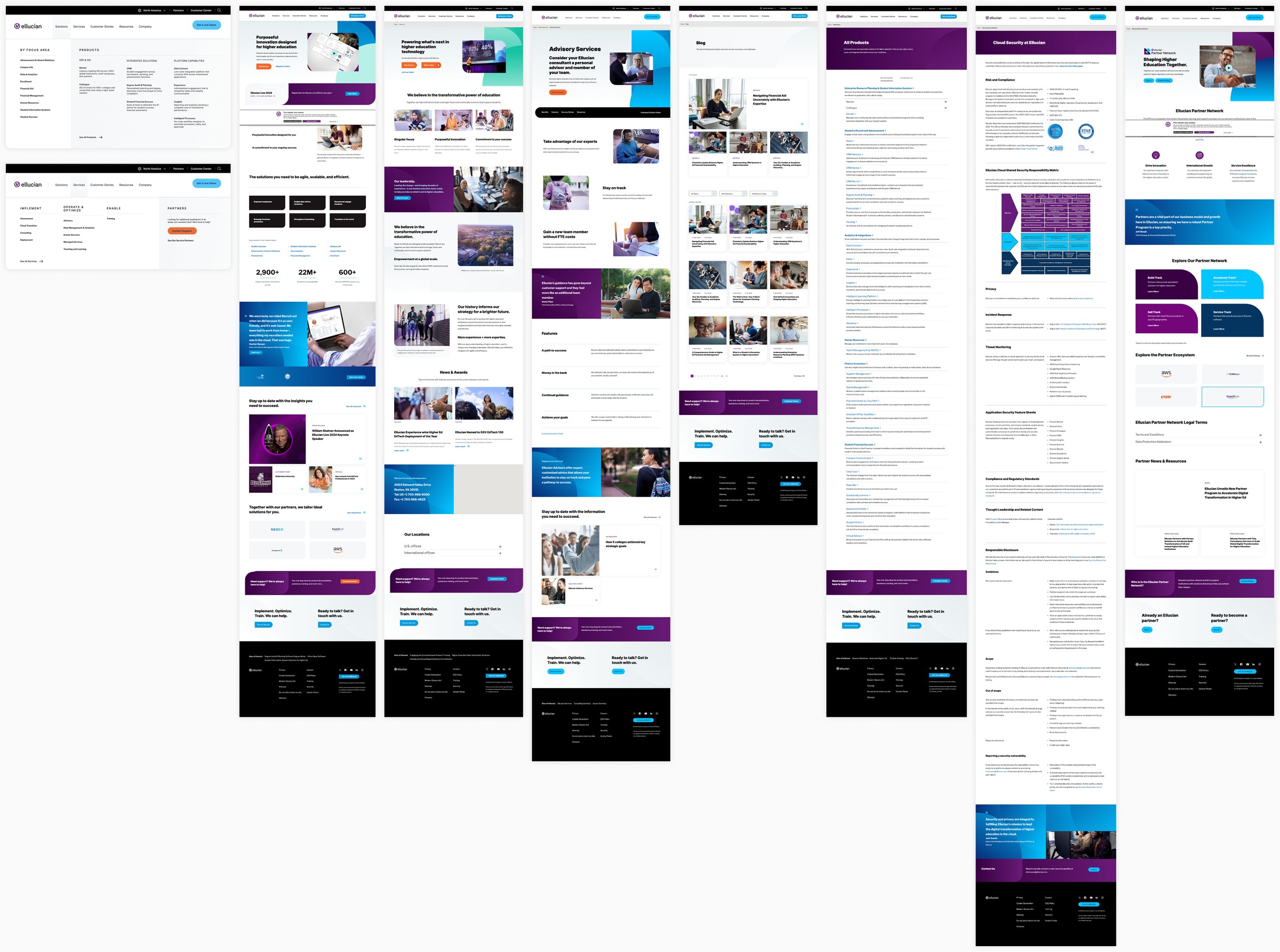
We started with the property itself. The legacy site carried real technical and design debt: products and services were branded as individual offerings rather than mapped to the outcomes users were searching for. Important pages sat too deep, labels came from internal org structure, and there was plenty of content but no sense of what mattered most.
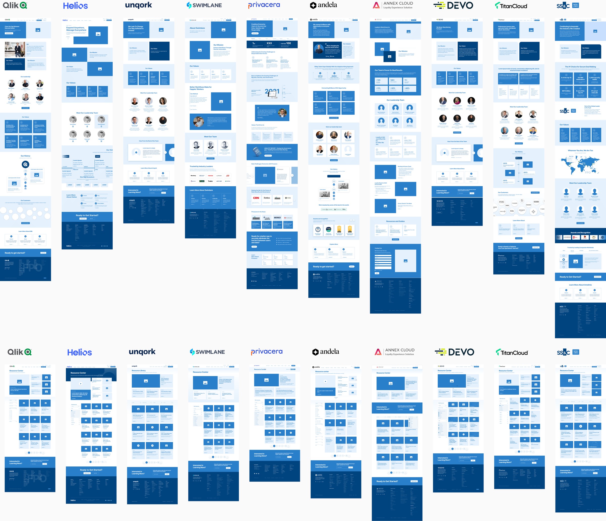
Then we looked outward. Higher-ed SaaS is crowded with the same promises: student success, digital transformation, modernization, cloud, lifecycle, outcomes, analytics, AI. So we audited the category and adjacent enterprise brands page by page to see where everyone sounded alike and where there was room to say something else.

Inputs
- Crazy Egg and heatmaps
- Google Analytics
- Client research
- Form submissions and downloads
- Competitive analysis
04
Taxonomy & IA
The teardown produced twelve page types that recurred across the category regardless of specialization, and the way those pages linked together was similarly consistent. Overlaying our own traffic and conversion data on those paths showed what people actually did, and that's what the new taxonomy was built on.
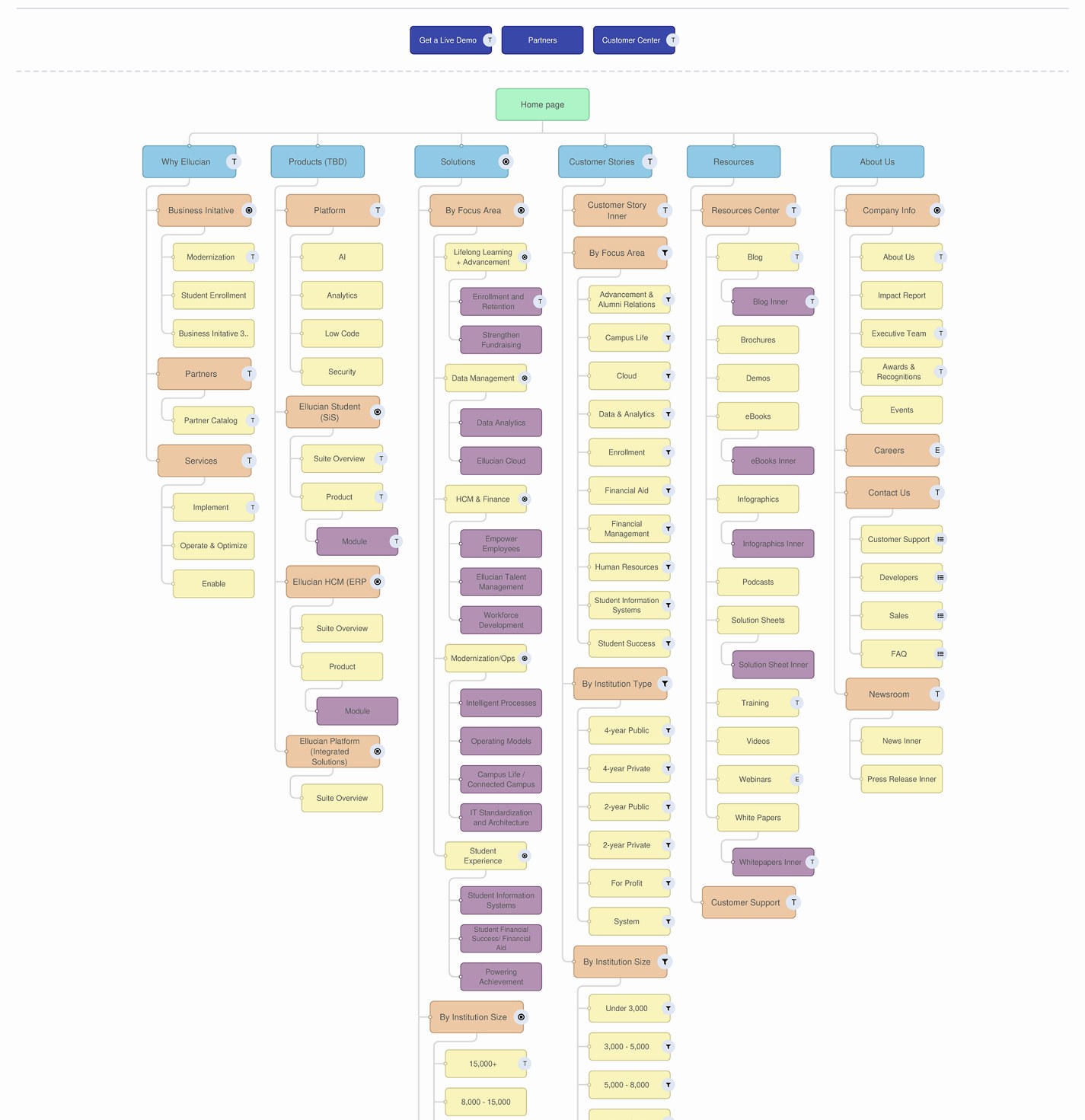
The new IA matched how enterprise buyers actually behave. They don't move in a straight line: they compare, validate, read resources, check customer proof, look for security, share links, revisit from another device, and use the nav as a confidence check. So the structure offered several valid paths, for direct buyers, explorers, skeptics, researchers, and implementation teams. The goal was less about finding pages and more about staying oriented.
05
Wireframes & testing
With the taxonomy settled, we wireframed the full page system, every template the new IA needed, desktop and mobile, built as modules rather than one-off layouts.
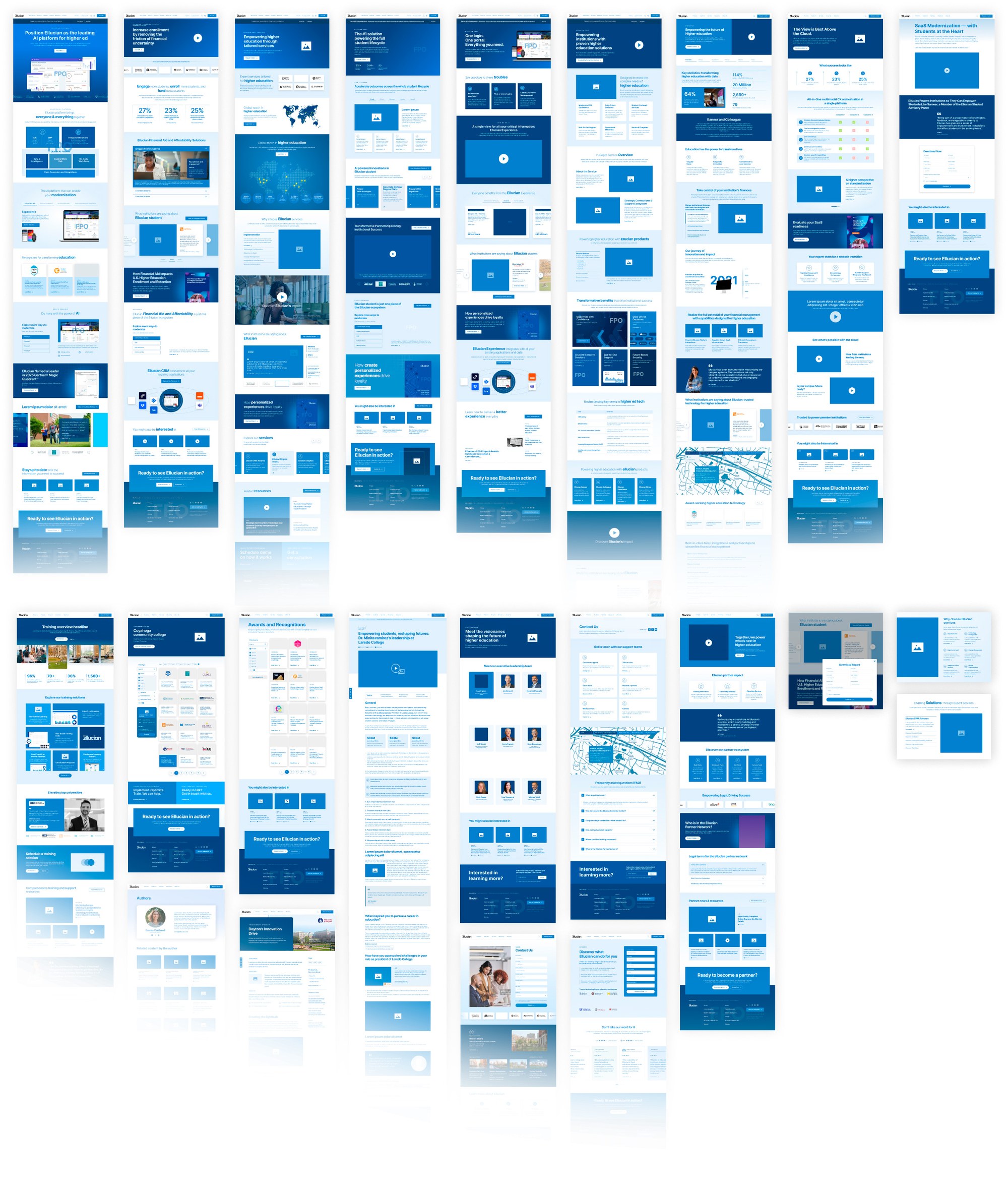
Moderated sessions tested confidence, language, and credibility; automated testing checked task completion and path clarity. Users liked the student-centered story but wanted to know sooner where they fit into it. We tightened labels, elevated proof, grouped products more clearly, added crosslinks, and made CTAs match user intent.
The content model came out cleaner: high-level pages sell the problem, mid-level pages explain the ecosystem, product pages give specifics, resources build confidence, and CTAs match intent.
06
Brand system
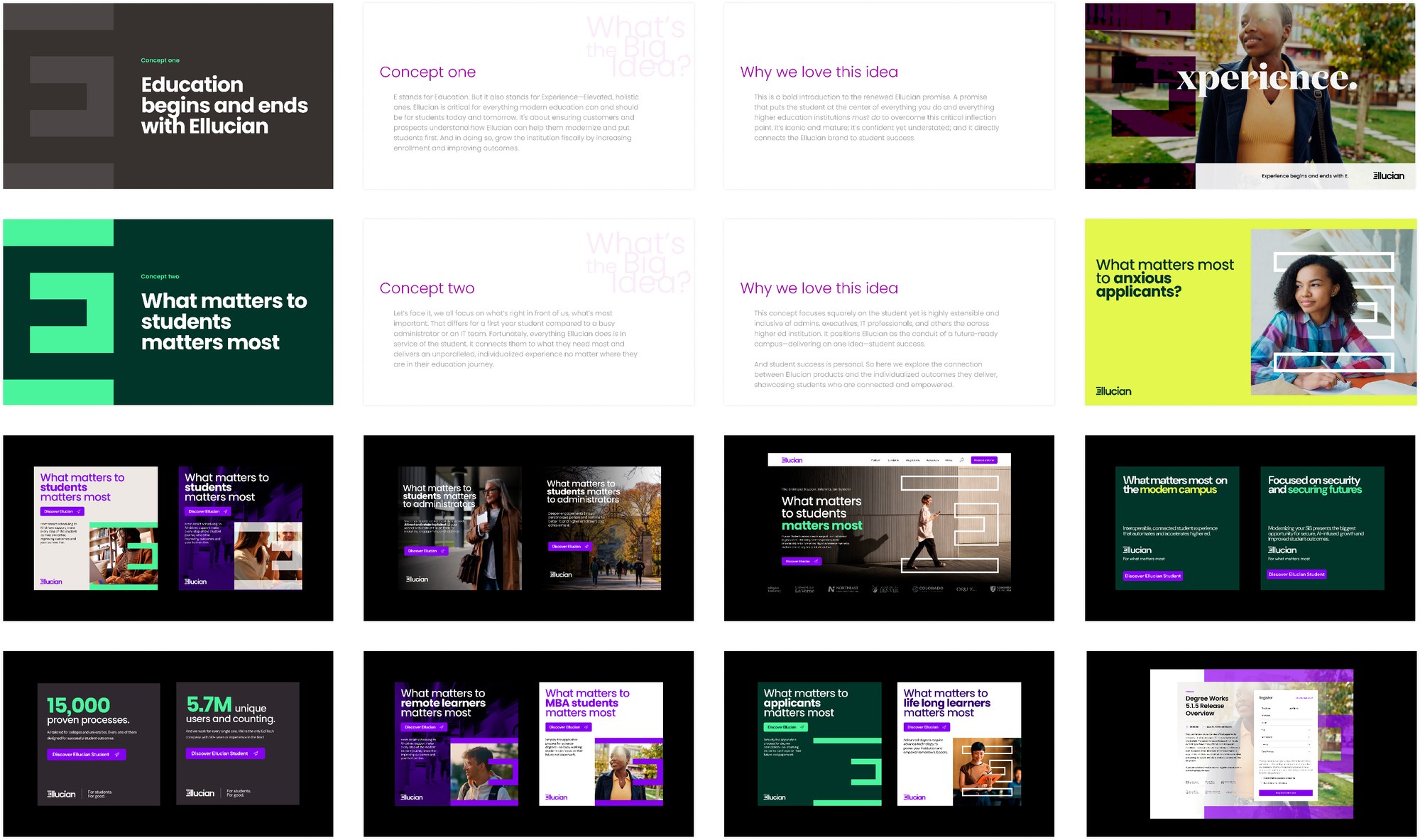
After testing several lines, we landed on a positioning statement that resonated internally and with the audience: what matters to students matters most. It was simple and hard to argue with. But sentiment alone doesn't sell enterprise software, so the UX had to pair that message with institutional outcomes, product clarity, platform credibility, and customer evidence in the same system.
07
Delivery
Motion was used carefully: Lottie microanimations explained platform connectivity, data movement, and product workflows. A trade-show launch window made the deadline tight, so visual design and development ran in parallel. That only worked because the team stayed system-first: components, tokens, modules, reusable patterns, AI-assisted handoff, smoke testing, accessibility checks, batch QA, and regression review.
UAT ran with 18 initial participants, and ultimately to a 19K-subject sample.
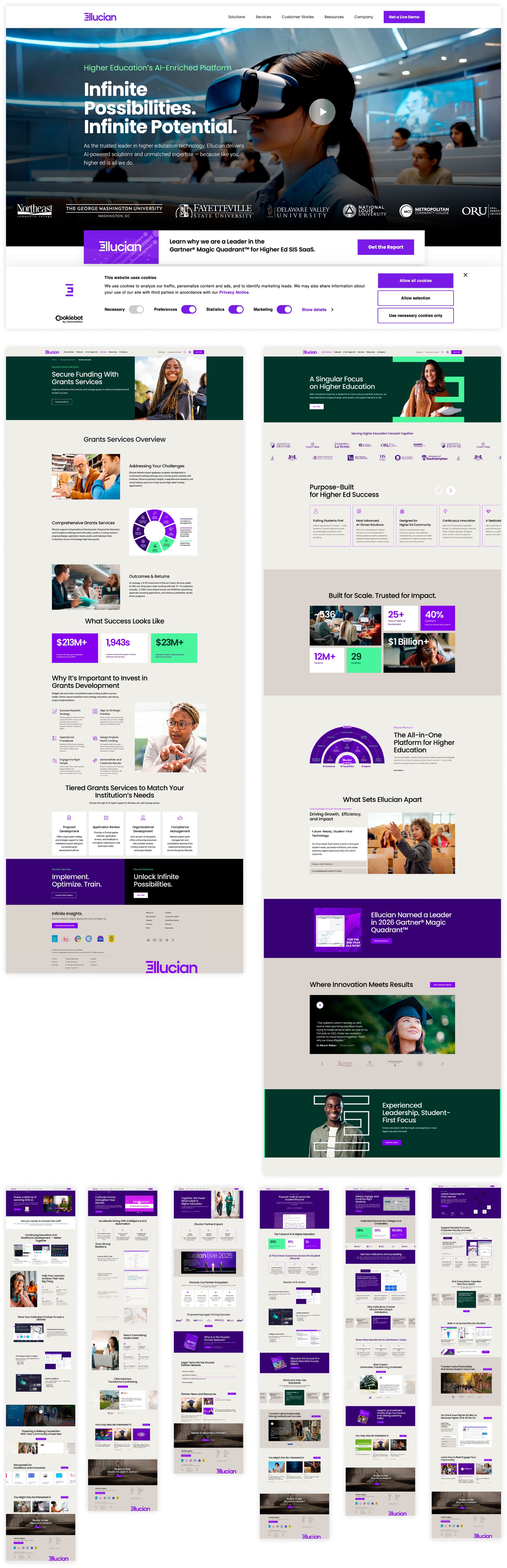
The structure did the selling: faster product discovery, fewer front-door bounces, and a measurable lift in demo intent.