
Wripple
A client dashboard redesign and design system for a premium talent marketplace.
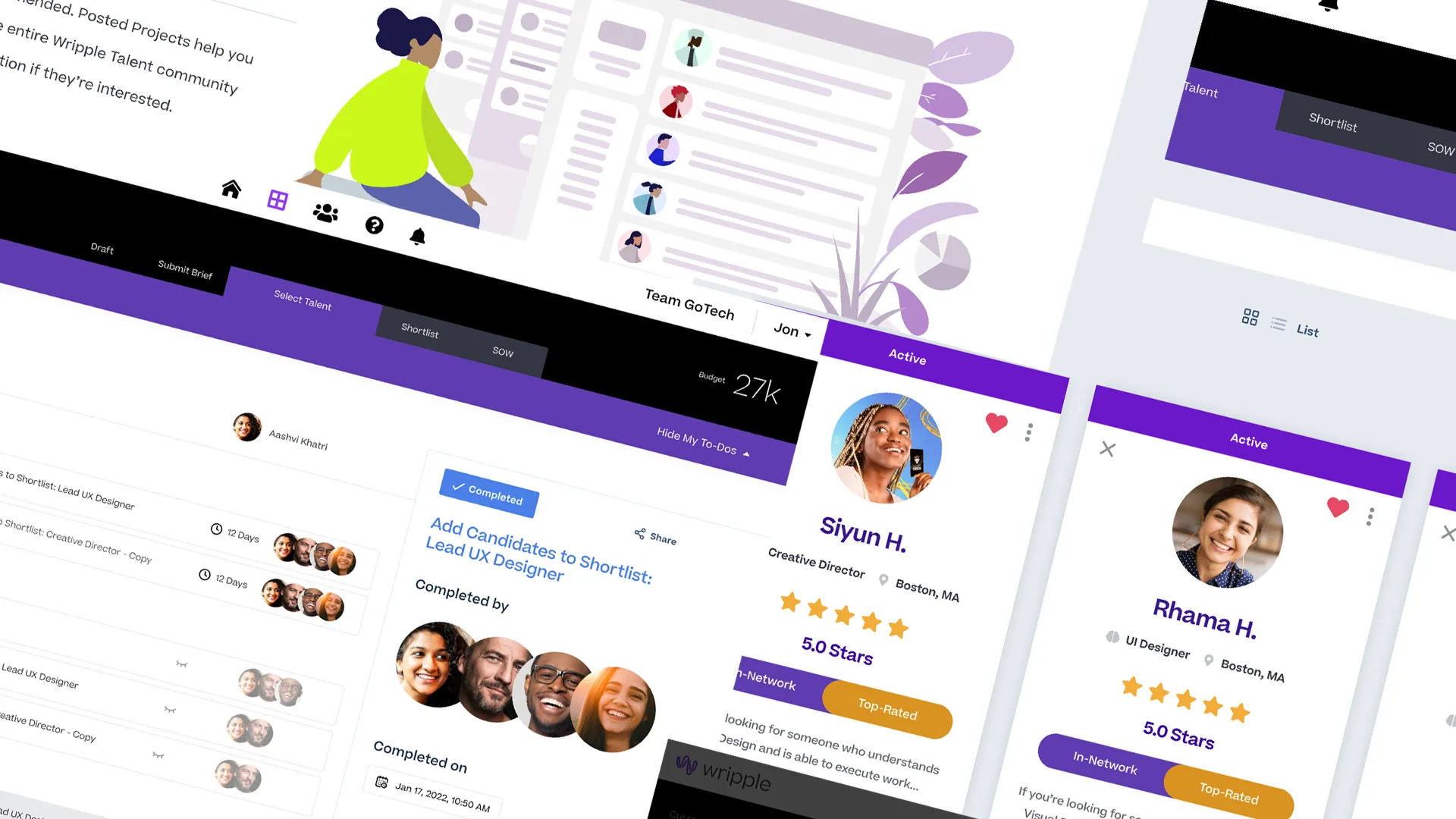
Wripple is a creative services agency that specializes in premium talent. After working with them for a couple of years, I was brought on to design a client dashboard with a set of new features.
I handled this project end to end on my own: requirements, flows, interface design, the design system, and the illustration and microcopy that explain how the product works.
Role & timeline
- Role
- Sole designer
- Timeline
- Multi-sprint engagement
- Responsibilities
- Requirements, user flows, dashboard design, design system, illustration, microcopy
- Key skills
- Product UX, atomic design systems, filtering and search, marketplace UX
Problem
The navigation, filters, and progress bar were confusing and did not match the quality of the service itself.
Goal
Deliver a premium client dashboard, and build a design system to keep it consistent as new features ship.
01
Overview
After reviewing the main navigation and controls, I told the client the experience needed to be simpler. The talent was already good; the dashboard was the weak point. The navigation, filters, and progress indicator made clients stop and figure things out before they could do anything.
The other big gap was structural: there was no real design system based on the atomic model, and no use of practices like nested components and variants. Every new feature was built from scratch, so inconsistency piled up with each release.
Focus areas
- Simplify navigation and primary controls
- Rebuild talent filtering as a core feature
- Clarify project progress and status
- Build an atomic design system with variants
- Explain new concepts through illustration and microcopy
02
Process
For each sprint I worked with the client to draft detailed requirements for specific features, then mapped user flows that fit the existing system. The client-side product is complex, so it mattered to cover every case before design began.
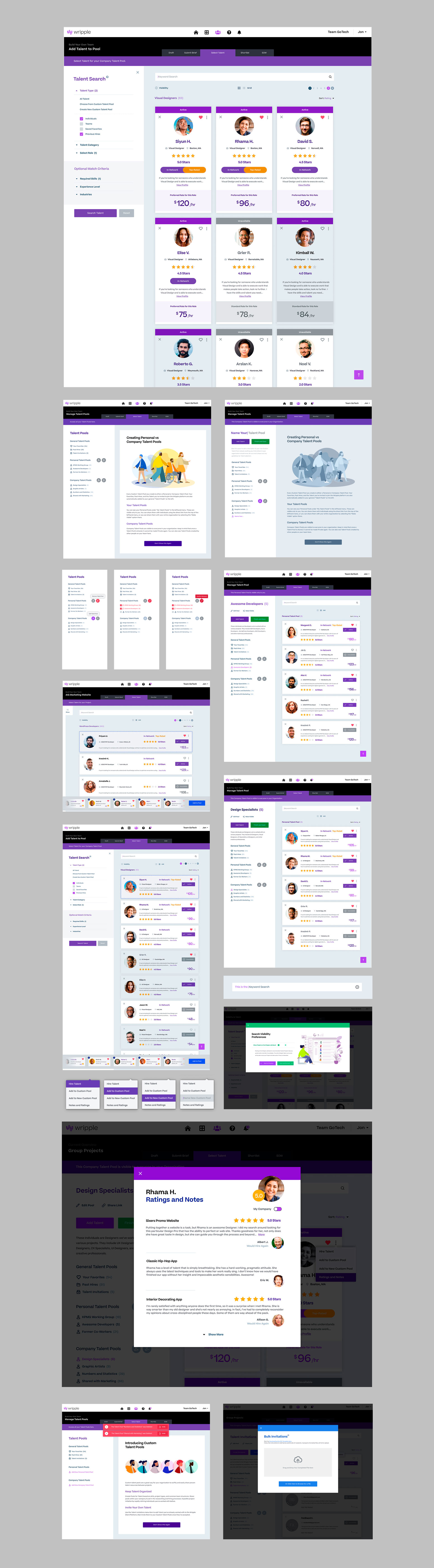
Starting from thumbnails, we built a full set of new design elements, cards, tiles, modals, and a large set of new screens on top of them.
03
Design system
On the system side, I worked with Wripple to organize the existing colors and fonts, then built a new design toolkit using the atomic model, with instructions for other designers on how to adopt it in stages. The team needed to keep shipping while the system took hold, so gradual adoption was the only realistic path.
04
Filtering & guidance
The point of the upgrade was to let clients build their own talent pools, whether assembling a team from scratch or bringing a team they already worked with and keeping their own notes, documents, and rates attached to it. Filtering was the main entry point, so new controls and supporting copy had to explain what each control actually changed in the results.
The old interface stacked too many steps between a client and a team: search, then filters, then role selection, then a separate assembly step, each in its own screen. Our job was to fold those steps into one continuous flow.
For budget reasons the client kept using the Humaaans illustration library, so I created larger illustrations with the same method to explain key concepts, paired with short text that helps clients learn the dashboard as they use it.
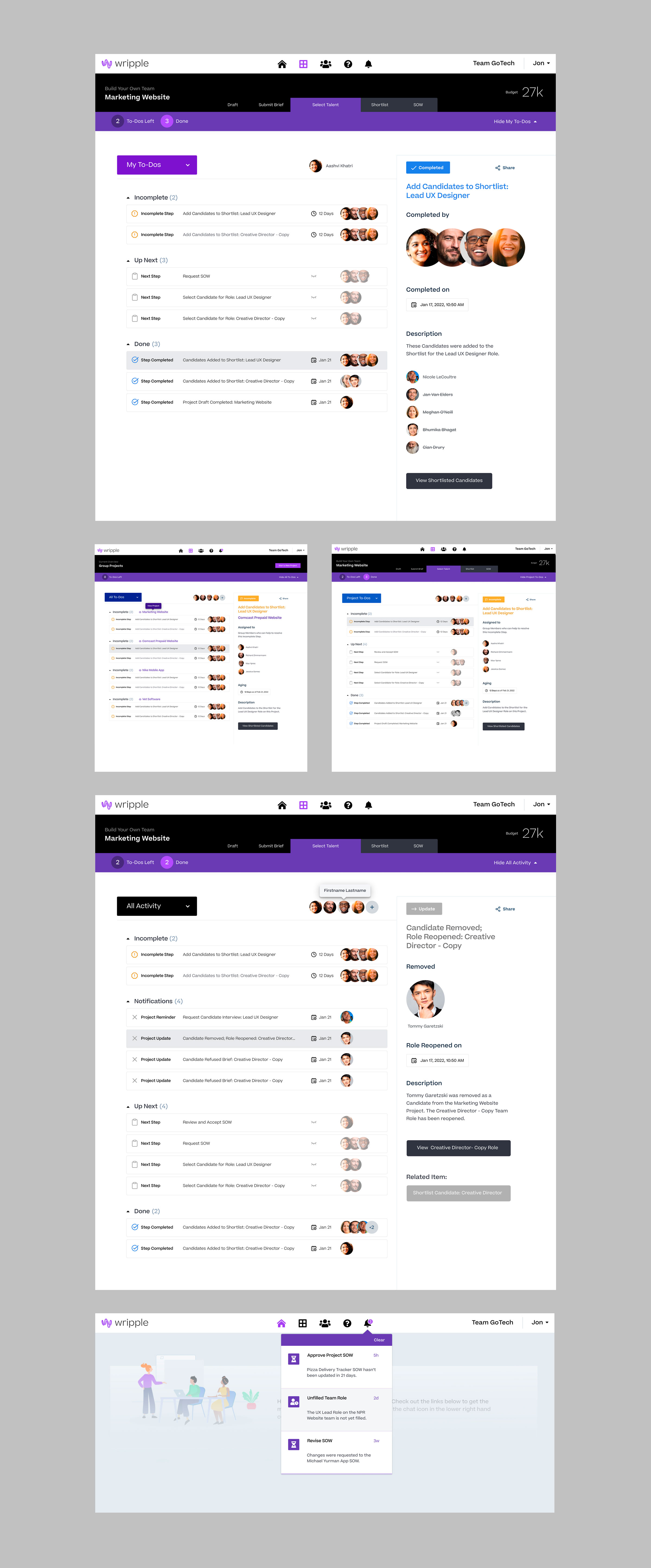
The new dashboard opened doors the old one couldn't: clients can spot unfilled team roles and fill them on the spot, which has moved revenue as much as it has satisfaction.